Friday, 4 May 2012

Saturday, 28 April 2012


Album Art


To create this album art I fixed the open white space with the 'heal tool' and then proceeded to blur the surrounding image to make it less noticeable. I then flipped the image and inserted the parental advisory logo. I finally found a font I liked and changed the colour to white and turned the opacity down. I then colour corrected the image using 'curves' among other tools. I didn't add the artist name as a statement. It connotes that the artist is so well known people should know exactly who done it when they see it anyway.


Magazine Front cover, Contents and double page spread Mock up
Front page

Contents

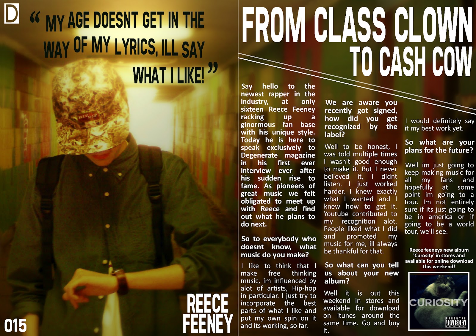
Double page spread


Costume for Magazine Photographs
The actor I am going to use will have to wear appropriate clothing which will match my style and genre of my magazine, below I have compiled a list in which I may use to determine what he must wear.

Using this I believe the actor will fit my genre. Below is a picture of the rap collective 'Odd Future' I have put this image here as it is something I would like to recreate in terms of clothing as it is unique . They have a laid back style and also a very uncaring attitude which I would like to come of in the images.


Thursday, 26 April 2012


Mood Board

Here is a mood board I have created using Adobe Photoshop. I tried to concentrate on my genre and its influences. I have compiled multiple iconic images of rappers, rap collective group logos, designer makes and and just general style. In this image I have experimented with opacity and the organisation of my layers.
Wednesday, 8 February 2012
Feminism in the media
What is Feminism?
Feminism was society’s response to the inequality of women. Before this movement women were treated as objects and passive agents in a male dominated world. The feminist movement Began in the eighteenth century but ran through the Suffragette movement. This Movement for women's votes in the early part of the twentieth century. This allowed many women to have usually male occupied jobs such as the military. The sex equality was passed on 1975.
Laura Mulvey's Theory..
The male gaze theory created by Laura Mulvey states that audiences watch films in two different ways, Voyeuristically and Fetishistically. Audiences watch the movie usually in a darkened room, the actors cannot see the audience and therefore they are watching Voyeristically. This leads us to two things, the first being objectification. The objectification of female characters in relation to this controlling gaze (male). The second is narcissistic identification an ideal image on screen. Laura Mulvey believes the more we look at something the more we desire it and therefore looking at tv or films creates a want in which we turn into a fetish.

Beth Ditto
Above is a magazine cover with Beth Ditto as the main image, this links into feminism as we usually wouldn't associate Beth with modelling as she not believed to be very appealing to men. The perception is that all men are attracted to skinny women, Beth is confident with her body and in society today this is a bold stance. As well as this she is showing her armpit hair with is also deemed as un-attractive.
Thursday, 2 February 2012
Mockup & College Magazine
Final Image

Here is my finished college magazine front cover. I have used Cardinal Heenan as my basis for the idea. I knew my audience would be students, so I used a area which they would be familar too as it would gain there attention. The Masthead and logo in this cover makes it easy to distinguish what it is along with the main image; as it is taken just outside the school.
Mock up

Here I had took inspiration from other college magazines I had looked at and decided that that I wanted to achieve a simplistic look as it looks clean and professional and at this moment I have a lack of skills concerning 'Adobe Photoshop'.
Contents Page Mock

Here is a contents page design I have created, it is simple and eye catching and unique in comparison to other contents pages I have witnessed. I have put the logo issue number all together so it is easy to tell when the magazine is from. The layout overall follows the mock up I did of the front cover; clean and simple. I believe this catchs the audience attention as much as possible.
Thursday, 26 January 2012
College Magazine Analysed

Who is the Target audience?
The target audience for this magazine is teenagers who are likely to attend carmel collage they will be around the age of sixteen and upwards.
How do you know it is for the target audience?
We can see it is a college magazine, because it has no barcode and it is free, as well as this it has the logo. The image used is a teenager which will engage the audience as they can relate to the image.
How does it engage the target audience?
The light hearted colour scheme is inviting to a younger audience, the font is also very informal and interesting. The Headline is quickly read and stands out and conveys the message easily.
What are the ideologies of the college from looking at the front:
What are there priorities?
They are trying to encourage people to come to Carmel College and also motive people to do well as the year before had done so well. Moreover they are congratulating there current students.
What do they consider important, how do they get this across?
They get their point across with there main image and headline it stands out. The fact the girl is so excited provokes curiosity then the headline reveals as to why. We want to feel they same amount of happiness to we are encouraged to find out more.
What image have they used? Why? What Camera Angle have they used?
They have used a medium shot from the side, it looks as if you are looking at the girl without her knowing in the middle of a celebration. They have done this so it looks as if you are looking at the scene as it happens, its naturalistic and believable so it is therefore relatable.
What is the Mise En Scene of the cover? Why?
The girl is wearing a brightly coloured dress which stands out against the bland clothes everyone else is wearing, show she is important. So it focusses our attention more on her.
Would this successfully engage the reader?
Yes.
Does the front cover reflect the contents?
The secondary images and features reflect the main image on the magazine as it is a student on a college magazine.
Wednesday, 25 January 2012
Magazine Terminology
Masthead - The title name of the magazine, it usually can be found in the top left hand corner but not exclusively here, an example would be 'NME'.
Banner - An attention drawing headline which would be the main selling point for the magazine E.g. 'Arctic Monkeys Split!'
Main Image - The central image conveyed on the magazine cover, it takes up most of the space.
Buzz Word - This can include words like: WIN, FREE or Special Edition it makes the magazine seem valuable or something you need to obtain.
Headline - It is a few words that add an extra selling point related to the main image, it sums up the main story inside.
Barcode - Defines that it is a magazine, shows it is priced. It also shows its issue number and therefore proves its a legitimate copy and makes it a collectable. We can also find out how long the magazine has been around from the issue number.
Anchorage Text - It is there to explain the headline and also explain the image. It goes into more detail than a headline.
Puff - A shape that stands out and could contain a Buzz Word or give away items.
Secondary Images - Other images that don't need the same attention as the main one.
Features - What else is in the magazine besides the main story.
Pug - An incentive to open the magazine it is most likely found in the corner.
Thursday, 19 January 2012
Questionnaire!
If you have some spare time please fill out a short questionnaire to help my Media A/S level, thank you.
Click here to take you to the Questionnaire!
Click here to take you to the Questionnaire!
Wednesday, 18 January 2012


Introduction
Welcome to my Media A/S Level Blog, here I will post my most recent pieces of Coursework. My task consists of creating a front cover of a music magazine with the style of my choice. To ensure I produce the best piece of work I can I will first create numerous drafts in which I will practice upon, I will also try to take main aspects of a music magazine front page such as Genre, target audience and conventions into account. Hopefully throughout I will increase my knowledge of the technology used to create such covers, as well as how they are arranged in such a way that makes it appealing.
My Style/Genre of choice is Rap/Hip-Hop.
Thank you for reading, feel free to leave comments.
My Style/Genre of choice is Rap/Hip-Hop.
Thank you for reading, feel free to leave comments.
Subscribe to:
Comments (Atom)